
London
Stock
Exchange
Diageo
Liquors
problem;
Navigating Complexity.
Imagine arriving at baggage claim after your flight, and every suitcase looks identical—no tags, no markings. You have to open each one to find your belongings. That’s a bit like what users at the London Stock Exchange (LSE) faced with their old internal dashboard. It was a complex, cluttered space filled with outdated information, making it tough for users to get what they needed quickly. The LSE serves a
39%
decrease...
in steps to create an ad campaign, reduced from 9 to 5 tasks.
optimized
performance
...across web and mobile by implementing a more intuitive user flow, designing collaboration tools such as real-time editing and asset sharing, and evolving and refining their onboarding experience.
Add a Title
navigating
complexity

challenge;
solution;
The UX solutions for Diageo’s internal media repository focused on streamlining campaign creation, improving search and asset discovery, enhancing collaboration, and optimizing performance across web and mobile. By implementing a more intuitive user flow, task completion rates increased by 42%, while steps to create an ad campaign were reduced from 9 to 5. Advanced search enhancements, including AI-driven recommendations and better filtering, improved search success from 65% to 92%. Collaboration tools, such as real-time editing and asset sharing, saw a 55% increase in adoption. Mobile responsiveness was optimized, reducing bounce rates from 48% to 21%, and page load speeds improved by 34% over competitors. A refined onboarding experience led to a 78% completion rate for new users, while accessibility updates ensured WCAG AAA compliance.
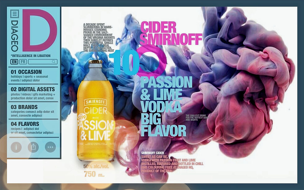
Diageo is a global leader in beverage alcohol with an outstanding collection of brands across spirits and beer. Diageo products are sold in more than 180 countries around the world. Our Task was to transition the current Diageo internal media repository's design and collaboration functions to better support wholesalers in creating and sharing DIY advertising campaigns.
case.study
solution;
The London Stock Exchange operates a broad range of international equity, fixed income, exchange-traded funds/exchange-traded products and foreign exchange markets. The objective was to redesign the internal dashboard used by the London Stock Exchange (LSE) to enhance usability, streamline workflows, and improve overall user satisfaction. The existing dashboard was outdated, cluttered, and did not effectively meet the needs of its users.
The primary users of the LSEG internal dashboard included: Traders: Who needed real-time data and analytics to make informed trading decisions. Analysts: Who required comprehensive data sets and tools for thorough market analysis. Administrative Staff: Who managed operational tasks and required efficient access to various functions.
As the UX Designer, my responsibilities included: Conducting user research to understand user needs and pain points. Facilitating design thinking workshops and qualitative interviews. Leading the design process from initial sketches to high-fidelity prototypes. Collaborating with stakeholders and developers to ensure the feasibility and implementation of the design.
With regards to Research we conducted Design Thinking Workshops with stakeholders involving vision discussions and card sorting activities to identify pain points and opportunities. Also, we instigated; Qualitative Interviews: Conducted in-depth interviews with traders, analysts, and administrative staff to gather insights into their daily tasks, challenges, and needs. Task Analysis: Analyzed user tasks to identify the most critical objectives, which informed the hierarchy of functions and features. Tools Used: Figma and Adobe XD for wireframes and prototypes, card sorting sessions for information architecture.
Our design process involved; Sketches and Wireframes: We developed initial sketches and wireframes to visualize the new layout and navigation structure. Prototype Development: Created interactive prototypes to test and refine the user experience. Usability Testing: Conducted usability testing sessions with users to gather feedback and identify areas for improvement. Iteration: Refined designs based on feedback and further usability testing to ensure the final design met user needs.
The redesigned dashboard resulted in: Improved usability and navigation, reducing the time users spent on routine tasks. Enhanced real-time data visualization, aiding traders in making quicker, more informed decisions. Streamlined workflows for administrative staff, increasing overall efficiency.
A clean, modern interface with a "Fresh" look. Customizable dashboards to meet the specific needs of different user roles. Improved data visualization tools, including charts and graphs. Simplified navigation with clear, intuitive menus and shortcuts.
The redesign of the LSE internal dashboard successfully addressed user pain points and enhanced the overall user experience. The new design was well-received by all user groups, leading to increased satisfaction and productivity.
Successes: Effective use of user research to guide the design process. Positive feedback from usability testing and user adoption. Successful collaboration with stakeholders and development teams. Challenges: Balancing diverse user needs within a single dashboard. Ensuring seamless integration with existing systems and data sources.
Continuous Improvement: Regularly gather user feedback to identify areas for further enhancement. Training and Support: Provide ongoing training sessions and support materials to help users fully utilize the new dashboard. Feature Expansion: Explore additional features and tools that could further improve the user experience and meet evolving needs.


problem;

vision;
